Blog
Aerospike's new branding wins gold and silver at the Graphis Awards
Explore the impact of great design on perception, trust, and success in the technology industry.
Blog
Explore the impact of great design on perception, trust, and success in the technology industry.
I am thrilled to announce that our newly redesigned brand identity has been honored with two prestigious awards at the Graphis Awards—Gold for our Aerospike logo and Silver for our comprehensive rebrand. This recognition is not only a testament to our creative vision but also a significant milestone in our journey as a leader in the technology industry and the way we present ourselves to the world.
Winning at the Graphis Awards is an extraordinary achievement. Founded in 1944, Graphis has a storied legacy of celebrating the pinnacle of design, advertising, photography, and illustration. Being recognized by such an esteemed institution places our work among some of the most respected and influential designs globally.
The Graphis are renowned for their high standards, with a rigorous selection process that identifies only the most exceptional and impactful work. Achieving Gold and Silver in this highly competitive arena signals to our customers, partners, and the industry at large that Aerospike’s brand identity meets the highest standards of creativity and excellence. This global recognition amplifies our brand’s visibility, reinforcing our position as a forward-thinking leader in the real-time database world.
We owe this achievement to the incredible collaboration with our design agency partner, Traina, whose expertise was instrumental in bringing our vision to life. Together, we’ve crafted a brand that not only resonates within the tech community but also stands out on the international stage and reflects our core values.
This recognition from Graphis is more than just an award—it’s a mark of distinction that validates our efforts to push the boundaries of design in the technology industry. As we continue to grow and innovate, this honor serves as a powerful reminder of the impact that great design can have in shaping perceptions, building trust, and driving success.
The problem statement: Aerospike’s business was at an inflection point, with rapid growth and maturation signaling the need for a brand that truly reflected our position in the market. Our previous brand identity no longer captured the essence of who we were becoming. That’s when we partnered with Traina, seeking a new brand position and identity that would not only differentiate us from competitors but also signal to the market that Aerospike had redefined what the category could expect from a database.
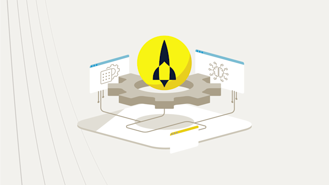
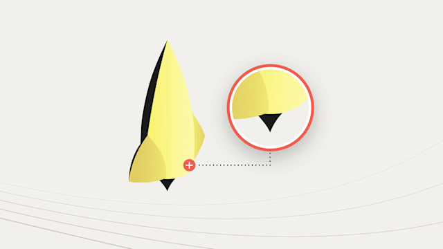
The design approach: The result is a brand identity that perfectly encapsulates our innovative spirit. Our new logo features a dynamic line continuation that forms an iconic rocket shape, thematically tying back to our brand name. The angular rocket shape complements the initial "A" of Aerospike, while the overall geometric aesthetic references our technical industry roots. The bold word mark (e.g. the “Aerospike” word in the logo) aligns seamlessly with the rocket’s fins, while the triangular afterburn juts out to align perfectly with the descender of the 'p.' The color palette of "deep space blue" and "sun yellow" delivers an aspirational, uplifting aesthetic in sync with Aerospike’s values and future goals.
We are immensely proud of this achievement and excited to leverage this global recognition as we continue to evolve our brand and expand our influence in the market.
Thank you to everyone who has supported us on this journey—here’s to more milestones ahead!
For a deeper understanding and more insights, explore these additional resources.
See more